Page 14 of 16
Posted: Sat May 04, 2013 4:05 pm
by Shalako
Like.
Posted: Sat May 04, 2013 8:59 pm
by Blackhound
Very good sasky.
Posted: Sat May 04, 2013 9:00 pm
by Blackhound
I was keeping this info with admin for Dragon's Maze, but I'll make it public now the spoiler season is over. I got in contact with WOTC about receiving possible a possible spoiler for this website and they responded to me in an optimistic manner. We did not however reason a spoiler for Dragon's Maze, nor did I expect to with our website having only a forum currently.
Perhaps we can make it a goal to have the front page at least in layout design by the next set, so when I talk to my contact again we can move higher on the list of prospects to receive a spoiler. We need ideas for what we
want the website to be. We've discussed writing articles and promoting streaming as well as maybe deckbuilder programs. Captain Murphy had an imaginary friend to make the website for us but he never surfaced.
Go!
Nice try anyway, im curious though, if someone came to this site with unofficial spoilers (leaks) would it be allowed ? Or would you rather have official spoilers from WOTC.
Burp.
Posted: Sat May 04, 2013 9:11 pm
by Kaitscralt
I was keeping this info with admin for Dragon's Maze, but I'll make it public now the spoiler season is over. I got in contact with WOTC about receiving possible a possible spoiler for this website and they responded to me in an optimistic manner. We did not however reason a spoiler for Dragon's Maze, nor did I expect to with our website having only a forum currently.
Perhaps we can make it a goal to have the front page
at least in layout design by the next set, so when I talk to my contact again we can move higher on the list of prospects to receive a spoiler. We need ideas for what we want the website to be. We've discussed writing articles and promoting streaming as well as maybe deckbuilder programs. Captain Murphy had an imaginary friend to make the website for us but he never surfaced.
Go!
Nice try anyway, im curious though, if someone came to this site with unofficial spoilers (leaks) would it be allowed ? Or would you rather have official spoilers from WOTC.
Burp.

Posted: Sat May 04, 2013 9:12 pm
by Kaitscralt
Only if they were from Nai
Posted: Sat May 04, 2013 9:14 pm
by Azrael
Posted: Sat May 04, 2013 9:36 pm
by Kaitscralt
I like the bloody banner a lot, much better than the punk rock shit smog one.
Posted: Sat May 04, 2013 10:13 pm
by Thrillho
yeah that banner is exponentially better than one with an anime version of a magic card (themed) character. don't get me wrong i love anime as much as the next manchild neckbeard, i just think there's a limit to the number of magic-related cliches we can include on the site and including most of them in the banner is way past that point.
Posted: Sat May 04, 2013 10:46 pm
by Sir Sapphire the 3rd
I like that newer banner idea a lot. Works well and simple.
Posted: Sat May 04, 2013 11:08 pm
by Kaitscralt
Put it up til we look into rotating ones more.
Posted: Sat May 04, 2013 11:19 pm
by TubeHunter
i like it
Posted: Sun May 05, 2013 3:38 am
by Sasky
Thanks guys.
")
Posted: Sun May 05, 2013 3:44 am
by zemanjaski
I like that a lot.
Posted: Sun May 05, 2013 3:49 am
by Kaitscralt
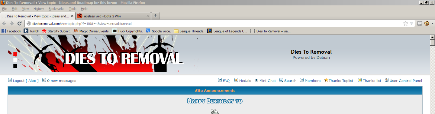
What's with the 3 colored squares on the left side, Sasky?
Posted: Sun May 05, 2013 6:20 am
by Sasky
Designy stuff? I don't know, just felt that there was too much negative space there. I could remove them if you wish.
Posted: Sun May 05, 2013 6:46 am
by windstrider
Nice job, Sasky. Keep the colored boxes. I don't know why, but I like them. Maybe have one for each mana color?
Posted: Sun May 05, 2013 7:16 am
by Khaospawn
Sasky - Fuck yeah!
Posted: Sun May 05, 2013 10:52 pm
by Neo Metal Sonic
New attempt:

With your default blue banner background:

Dude, this is super awesome. Love. While I liked the Chandra one, this one express the site much better.
Posted: Sun May 05, 2013 11:33 pm
by Sasky
Thanks guys, it's nice to know you guys like it.
")
Now we just gotta wait for an admin to notice it...
Nice job, Sasky. Keep the colored boxes. I don't know why, but I like them. Maybe have one for each mana color?
B/R/W are the prime removal colors

I could do all five colors when I get back. The blue might get lost in the background though.
Posted: Sun May 05, 2013 11:39 pm
by Neo Metal Sonic
About the blue, use a dark blue in the bottom. The gradient of the banner is dark blue in top and light blue in bottom.
Posted: Mon May 06, 2013 3:01 pm
by Blackhound
Only if they were from Nai
I can get to work on getting myself banned from this site if you want.
Posted: Mon May 06, 2013 3:04 pm
by Col. Khaddafi
You'll have to wait until someone cares to buy this dump. Then we will ban whichever users we will feel do not fit the "vision" of the new owner.
Posted: Mon May 06, 2013 3:11 pm
by Blackhound
Posted: Mon May 06, 2013 3:12 pm
by Blackhound
I offer $3.
Posted: Mon May 06, 2013 3:20 pm
by Col. Khaddafi
My Lord, who shall we ban?
Posted: Mon May 06, 2013 3:32 pm
by Blackhound
be silent about this, we need a plan in order to get various people from this site banned, dont tell anyone of your fellow staff members.
Posted: Tue May 07, 2013 2:20 am
by Sasky
Well the banner didn't fit that well. Is there anything I can do to make it fit? (like cropping etc.)
Posted: Tue May 07, 2013 2:26 am
by ExarionUniverse1
My Lord, who shall we ban?
ban me if you got too.
Posted: Tue May 07, 2013 2:42 am
by Sir Sapphire the 3rd
My Lord, who shall we ban?
ban me if you got too.
Stop talking stupid shit.
Posted: Tue May 07, 2013 3:11 am
by ExarionUniverse1
My Lord, who shall we ban?
ban me if you got too.
Stop talking stupid shit.
was actually serious
Posted: Tue May 07, 2013 3:23 am
by Sir Sapphire the 3rd
hence why its stupid.
Posted: Tue May 07, 2013 4:50 am
by Second Harkius
drama, dramagumbo
Posted: Tue May 07, 2013 7:10 am
by Mcdonalds
Banner looks cool, maybe try enlarging it a bit so you can hide the edges (if possible).
Posted: Tue May 07, 2013 11:05 am
by Col. Khaddafi
banner looks fine to me?

Posted: Tue May 07, 2013 1:07 pm
by redthirst
Looks ridiculously cool in CA Black, btw.
Posted: Tue May 07, 2013 3:37 pm
by Khaospawn
Banner looks great - Black, Red, and White are my favorite color combination.
Posted: Tue May 07, 2013 3:50 pm
by Thrillho
Well the banner didn't fit that well. Is there anything I can do to make it fit? (like cropping etc.)
please edit out that swatch around the corner. it looks like a demo item you're submitting as part of an ad brief.
Posted: Tue May 07, 2013 3:50 pm
by Thrillho
otherwise it looks cool 10/10 would buy again a+++++++++++++++
Posted: Tue May 07, 2013 4:28 pm
by Checkbox
Well the banner didn't fit that well. Is there anything I can do to make it fit? (like cropping etc.)
please edit out that swatch around the corner. it looks like a demo item you're submitting as part of an ad brief.
This, jesus christ.
Posted: Tue May 07, 2013 9:29 pm
by Alex
It doesn't match up with the border on SubSilver2. Also, can we get rid of the text? Powered by Debian and all that? Maybe put it at the bottom of the page instead if it's something that NEEDS to be displayed? It looks tacky.